Jewellery25 Jun 20263 MIN

The new wedding colour theory: Match your outfit to your gemstone

Forget coordinated sets—here's how to find the right code to pair your jewellery in combinations that will make it to every wedding guest's Insta dump

Image

Are you bored of seeing the same predictable colour combinations on repeat? Us too. So why not…reverse the approach? Here’s your go-to guide on how to work backwards and build a strong colour palette to match your gemstones this wedding season.

Most of us pick the outfit first and the jewellery second. The better approach is to pick a bold stone first and then accentuate it through the hues of a smartly selected outfit. Certain colour combinations look more elevated because they share the same warmth or depth. Others work because they sit on opposite ends of the colour wheel and create drama purely through contrast. Here's how to think about it, stone by stone.
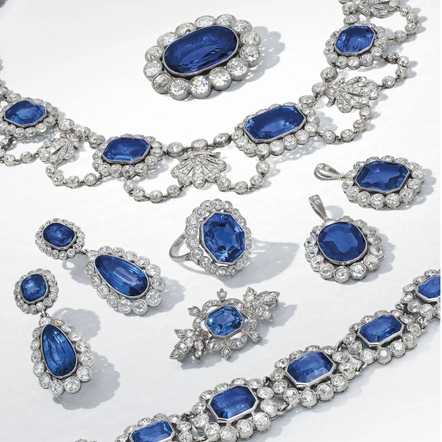
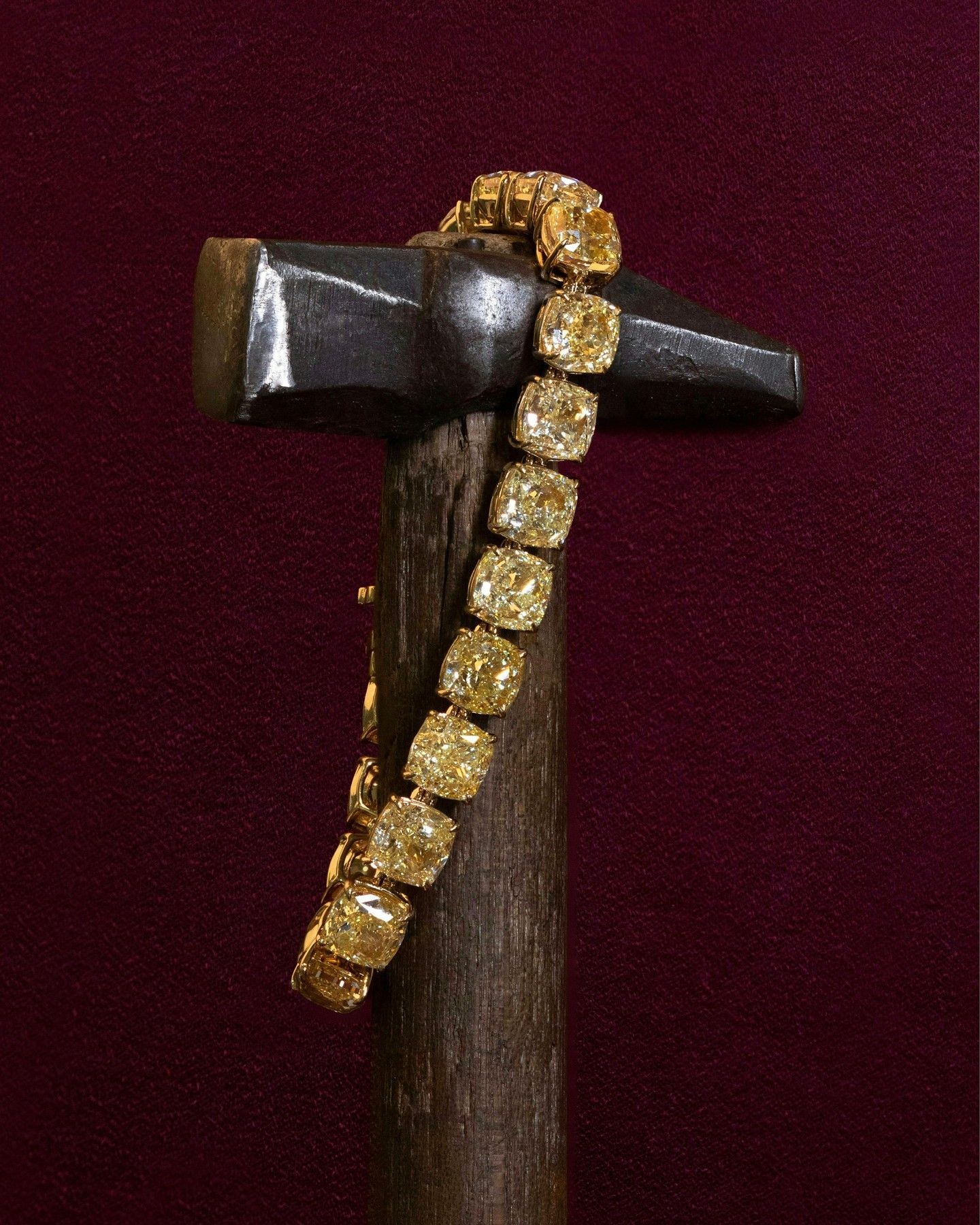
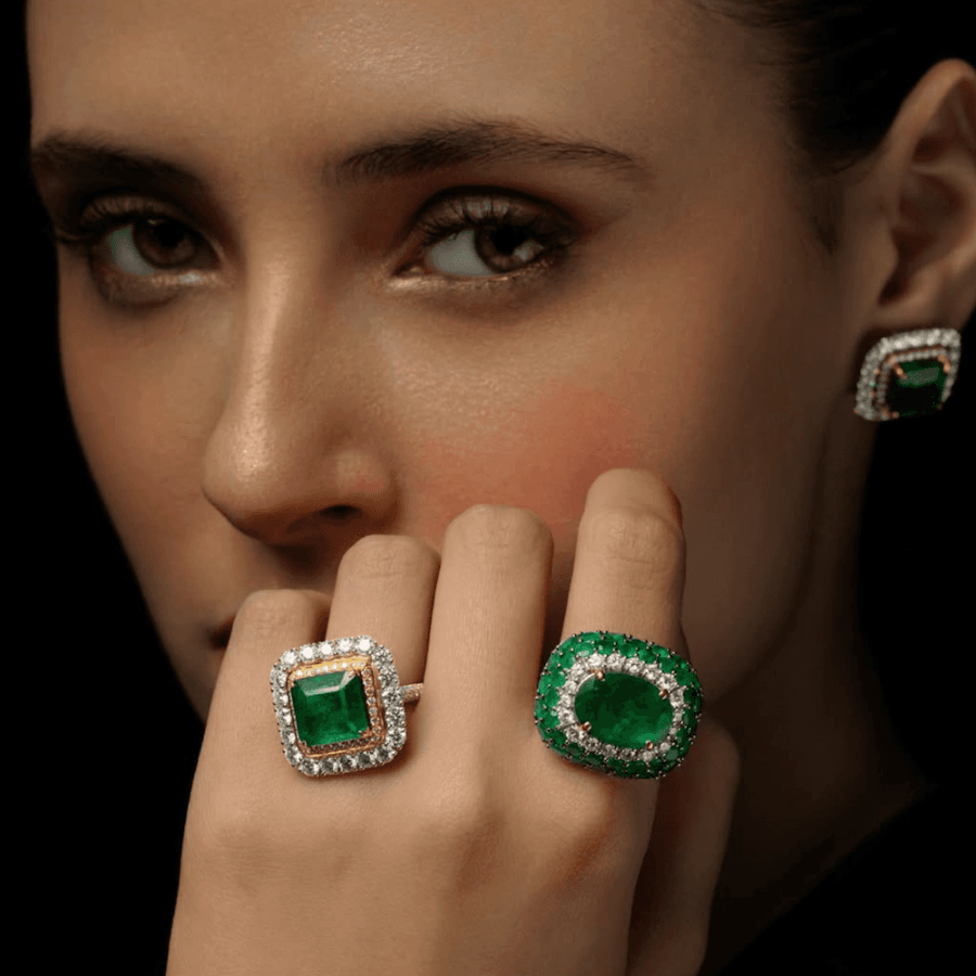
Red-y to ruby

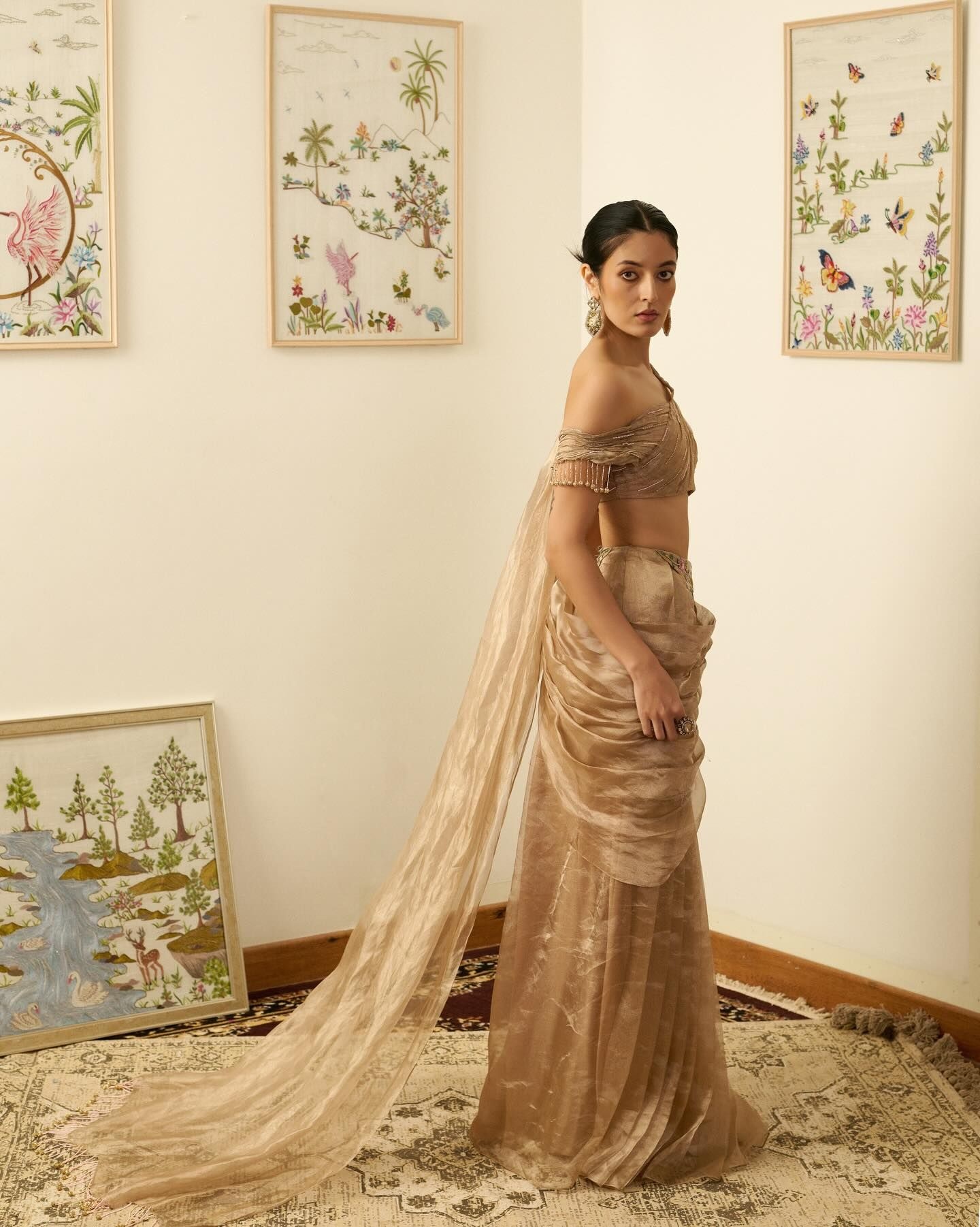
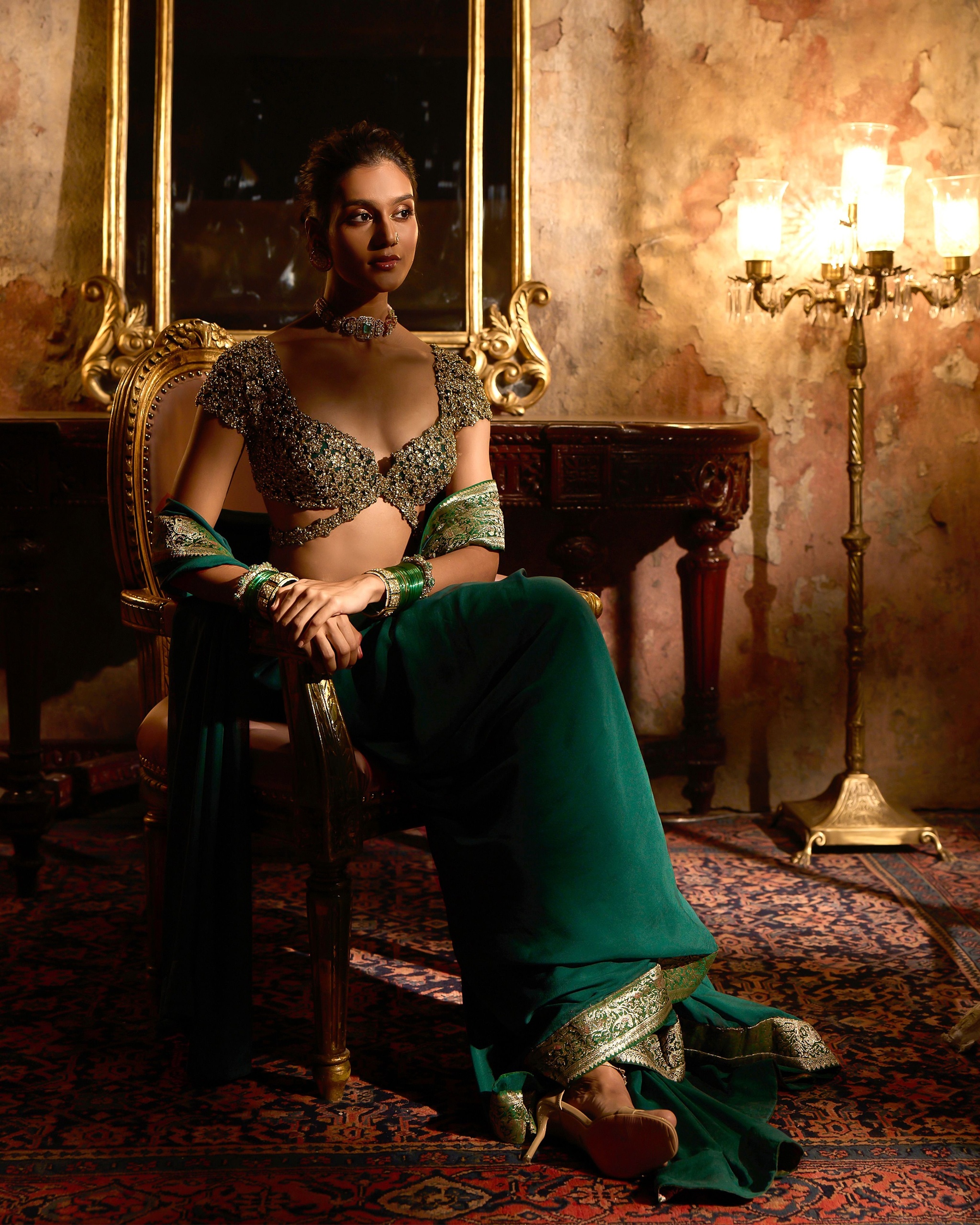
Rubies are a warm, highly saturated shade of red, which means it has two directions to move in. Pairing it with other warm, rich colours creates a tonal harmony creating a sense of depth as it sits in the same temperature family. The second is contrast through complementary jewel tones—pairing red with colours from the cooler or deeper end of the spectrum to create drama without looking mismatched. Pair it with a champagne gold for the most classic version of warmth on warmth. Same intensity, same richness and instantly regal. Or contrast it with a dark green. Two saturated jewel tones that work cohesively to share visual weight creating a bold yet elegant colour play.

The emerald effect

Green resides right in the middle of the colour wheel, making it one of the most flexible colours to dress around. It can either deepen further into rich, similarly saturated tones, or lighten and brighten against something more vivid for contrast. A rich plum shade goes toward the deepening direction—two jewel tones creating a layered opulence that feels calculated rather than busy. Or take a more experimental approach and pair it with a lime green that goes lighter and brighter. A tonal pairing that stays within the green family but shifts the mood entirely. More contemporary than the deep emerald most people expect.

Sapphire state of mind

Blue is a cool, grounding colour, and the colour theory here is genuinely a study in opposites. Red and blue sit almost directly across from each other on the colour wheel, making them complementary—the most attention-grabbing pairing there is. Silver, on the other hand, is a neutral metallic with no real warmth or coolness of its own, so paired with sapphire it creates a much quieter, monochrome-adjacent effect.

Bright like a diamond

Classic white diamonds are colourless, which means, in colour theory terms, the outfit carries the entire conversation. This makes diamonds the most adaptable stone on this list – but also the easiest to underuse if the outfit colour is too safe. Orange and rust bring warmth and energy to a stone that's usually paired with quiet neutrals, making the combination feel fresh simply because it isn't expected. Dark purple goes in the opposite direction. Deep, cool-leaning, and dramatic, the kind of pairing that reads as evening-appropriate the moment you put it on.

Diamonds but make it fancy yellow

Yellow is a warm, high-energy colour, so the way to style it is either to ground it or to soften it. Grounding means pairing it with a deep, cool, contrasting colour that absorbs some of the brightness and adds sophistication. Softening means pairing it with another warm tone of a much lower intensity, so the two coexist without competing. Navy blue is a prominent grounding choice, deep and cool, keeping the yellow diamond's warmth from tipping into flashy. Or pair it with a subtle blush pink, the softening choice. Both warm, but the blush is muted enough that the diamond still does the talking.

Pearls of wisdom

Pearls are soft, muted and naturally low-contrast, which means the safest approach is tonal. Pair them with colours close to their own creamy, neutral undertone—but a more romantic effect comes from pairing them with cool pastels instead. Match it with a beige for the tonal choice, letting the pearls blend in rather than stand out, elegant in its restraint. Lavender on the contrary, introduces a soft cool note instead, giving the pearls a gentle hint of colour without ever competing with their natural shine.

The Nod Newsletter

We're making your inbox interesting. Enter your email to get our best reads and exclusive insights from our editors delivered directly to you.