
Walk into any Rajesh Pratap Singh store in the country and your olfactory senses will be met with the pleasantly musky scent of tangerine and neroli, custom-blended for the brand. The Kala Ghoda outpost in Mumbai is no different. Spread across two floors, the expansive space houses the brand’s menswear and womenswear collections on the ground floor, with a bespoke consultation studio tucked away at the back. This is where you’ll find the designer behind the brand, Rajesh Pratap Singh himself, in his usual uniform of a white shirt—he has several specially made for work—tinkering with a new experiment. The second floor now houses the brand’s soft furnishings line, Pratap Home, which makes its debut in India this week.
Singh has never been one to chase trends or even adhere to the fashion calendar. Instead, he lets the work do the talking, trusting that those drawn to its understated appeal will find their way to him. A 1994 graduate of NIFT-Delhi, he cut his teeth at Italian menswear label Marzotto before launching his own label in 1997. He went on to lend his design sensibilities to Satya Paul while building his own practice, showing at Paris Fashion Week, exhibiting at London’s Victoria and Albert Museum, and opening stores across Mumbai, Delhi, Jaipur, and Bengaluru.
Even before entering the Mumbai store, you’ll spot a paper interpretation of the brand’s signature pintuck technique hanging in the window: a poofy, cap-sleeved dress. Created by folding and stitching narrow strips of fabric, the technique gives the material its distinctive three-dimensional striped texture. It recurs across the selvedge shirts, kurtas, jackets, and bandhgalas displayed on the ground floor. The palette for these pin-tucked garments, alongside almost everything else, stays muted, except for one section of the womenswear rack, where brocade pieces make a riotous case for reds, blues, and golds.
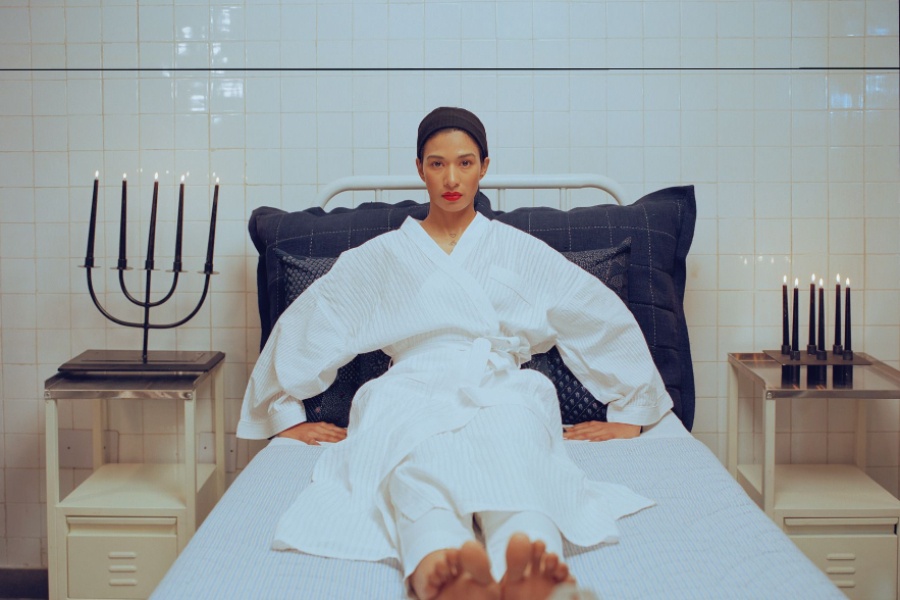
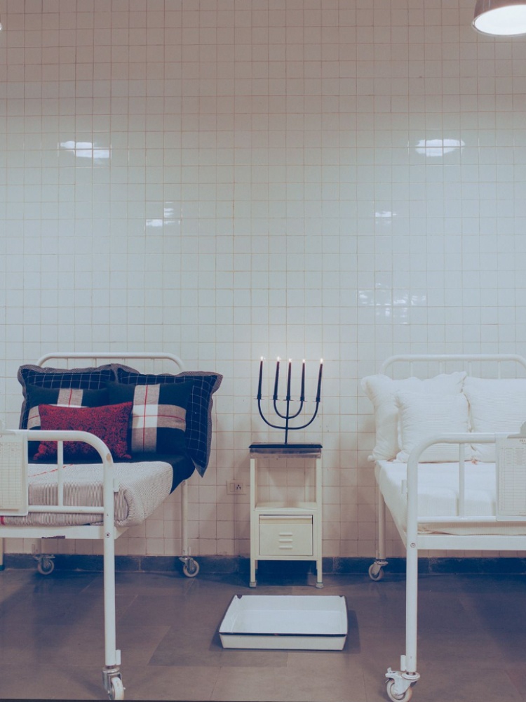
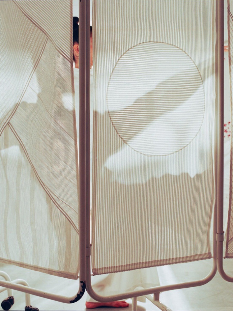
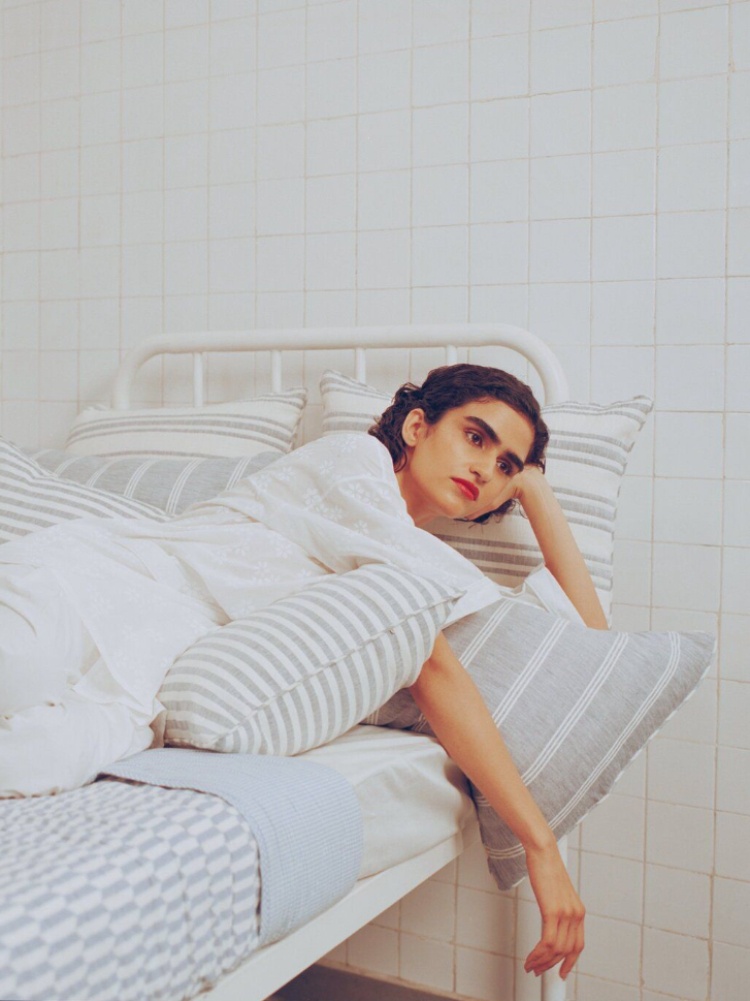
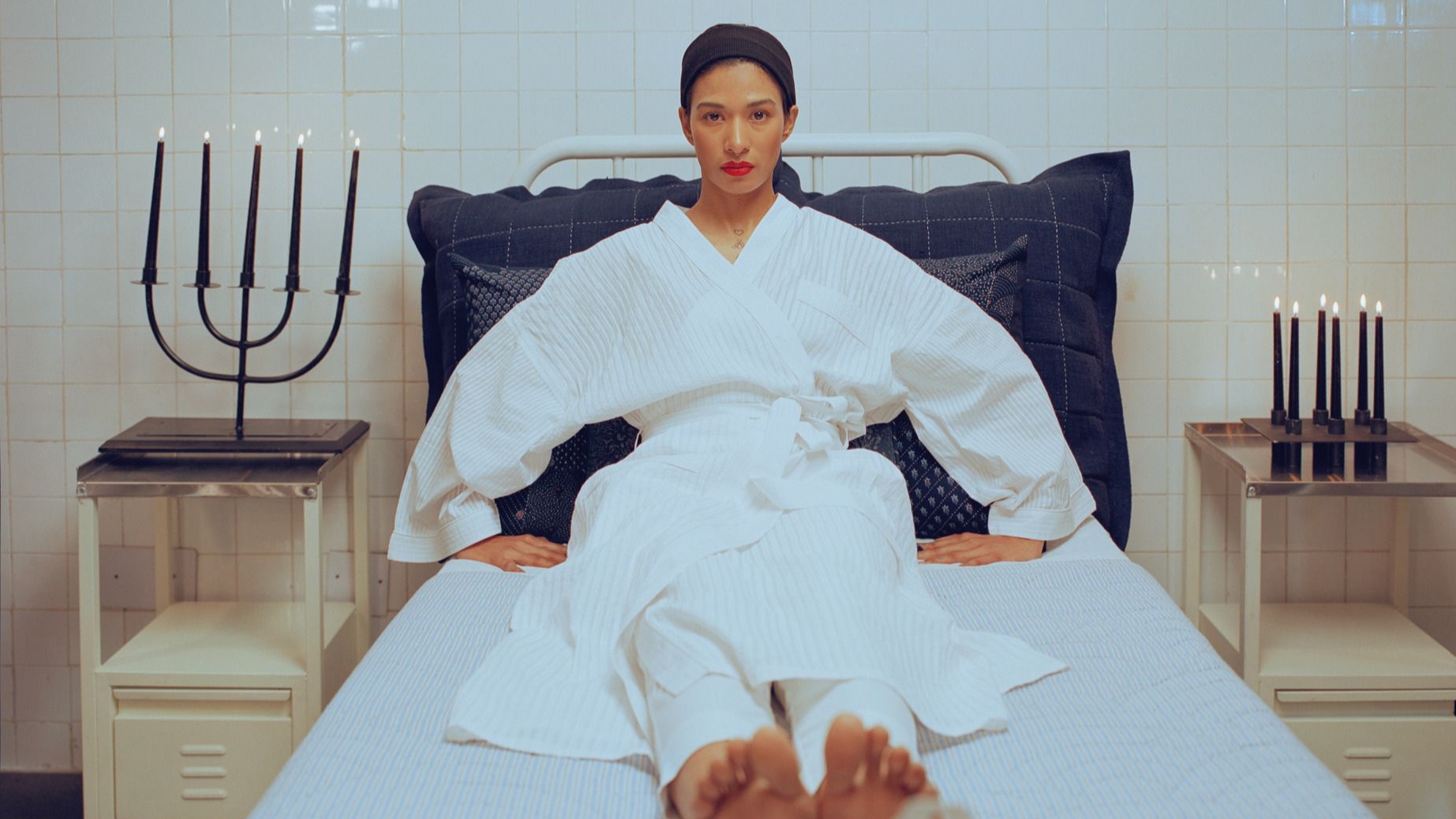
Upstairs, the main event mirrors the same textile language into the domestic realm, each product proudly showing off its self-finishing seams. The collection is displayed in a hospital-room-inspired setting—a somewhat revival of the set from the brand’s autumn/winter 2015 catwalk. Minimalist linen bedsheets, cushions, and quilts dress the beds, separated by sheer curtains that riff on the pintuck and selvedge details found downstairs. The blue-and-white quilts feature a ‘Welcome to the Jungle’ print, and block-printed and embroidered table sets come in indigo denim and cotton voile. There’s also breathable loungewear and sleepwear to match. A long table occupies one half of the room, laid with table linen and geometric candelabras.
Above, chandeliers lined with test tubes add another layer of eccentricity to the room. Just like the floor below, one corner of the room is lit with vibrantly coloured tile samples, while the rest quietly beckons in muted colours. If the hospital beds aren’t intriguing enough, the walls on this floor are a gallery unto themselves, with real heavy-metal ship portholes bolted into them. Their circular frames are refitted as display cases for miniature figurines dressed in custom RPS.
Ahead of Pratap Home’s India debut, we sat down with the designer to talk about the collection, mountains and deserts, hospitals, and the ideas that continue to shape his design practice. Excerpts from the conversation: