A custom Gucci Ancora Airstreamer travelled around New York City in February, offering warm beverages to visitors
Courtesy Gucci
Fashion 28 May 2024 8 MIN

Why colour is the new luxury logo

As the digital landscape expands, brands are claiming ownership of colours to create recall in a saturated digital space

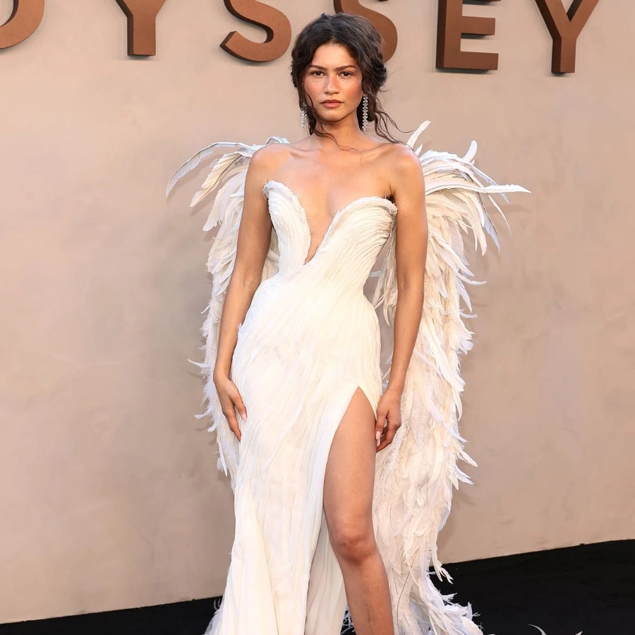
In March of 2022, Valentino’s then creative director Pierpaolo Piccioli presented a ready-to-wear collection devoted almost entirely to Pink PP, a new shade of hot pink developed in collaboration with Pantone. The eye-searing fuchsia was everywhere—from the show’s set in Paris to the brand’s social media—and it went viral almost instantly. Friends of the house, including Zendaya, Anne Hathaway, Florence Pugh, Lewis Hamilton, to name a few, began sporting head-to-toe monochrome looks from the collection, which were instantly recognisable without a logo in sight. The pink-out was impossible to escape, pervading Instagram and TikTok from the day of the show until long after the collection hit stores, well into 2023.

The relationship between brands and colours is a tale as old as time. “Colour has been an important factor in marketing since the First Industrial Revolution in the mid-18th century,” points out cultural historian Dr Regina Lee Blaszczyk, much of whose work revolves around the relationship between colour and commerce. “The 20th century saw the rise of the first global megabrands, and with them, the use of colour as a brand signature. One of the most important 20th-century examples was the use of red in the Coca-Cola logo.”

The bright red hue is so ingrained in consumers that James Sommerville, vice president of global design at Coca‑Cola, has called it the company’s “second secret formula”. Fashion has its own famous, unflinching examples. Take Tiffany & Co.’s robin egg blue (the Pantone shade is named 1837 Blue, after its founding year) or Hermès’s warm citrus orange. Both brands have trademarked these specific shades for various applications and have been using them in their packaging for decades. “Colours are valuable assets for brands. It is a way for them to not only differentiate themselves from their competition, but as colour is a language, it is also a way for a creative director to broadcast the meaning and image of their brand,” says Laurie Pressman, vice president of the Pantone Color Institute.

And now, brands are going a step further. Like Bottega Veneta, whose parakeet-green accessories and garments during Daniel Lee’s tenure as creative director gained ‘it’ status among the fashion set. The same vibrant shade of green then popped up in the brand’s packaging, retail windows, hoardings, and pop-ups. Soon enough, shoppers and fashion journalists began name-checking the brand in association with the colour, dubbing it the ‘Bottega green’. These bags and clothes became objects of desire, thanks to a push from tastemakers such as Hailey Bieber, who has been spotted in the bright green hue.

Currently as chief creative officer at Burberry, Lee is attempting to replicate the success of Bottega green with a specific, electric shade of blue. After discovering the eye-catching hue in a version of the Burberry logo from the ’80s, he splashed it across his debut collection in February 2023, introducing ‘Knight Blue’ to the world. On the runway, we saw satin jersey t-shirts depicting blue roses with the words ‘Roses aren’t always red’ printed on them. Since then, the brand has painted London’s Bond Street tube station in Knight Blue and doused the city’s flagship Harrods store in that colour to kick off the department store’s 175th anniversary celebrations. Even the store’s doormen, who usually wear emerald green uniforms, were decked out in—you guessed it—Knight Blue checks.


A post shared by Burberry (@burberry)

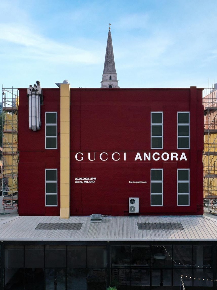
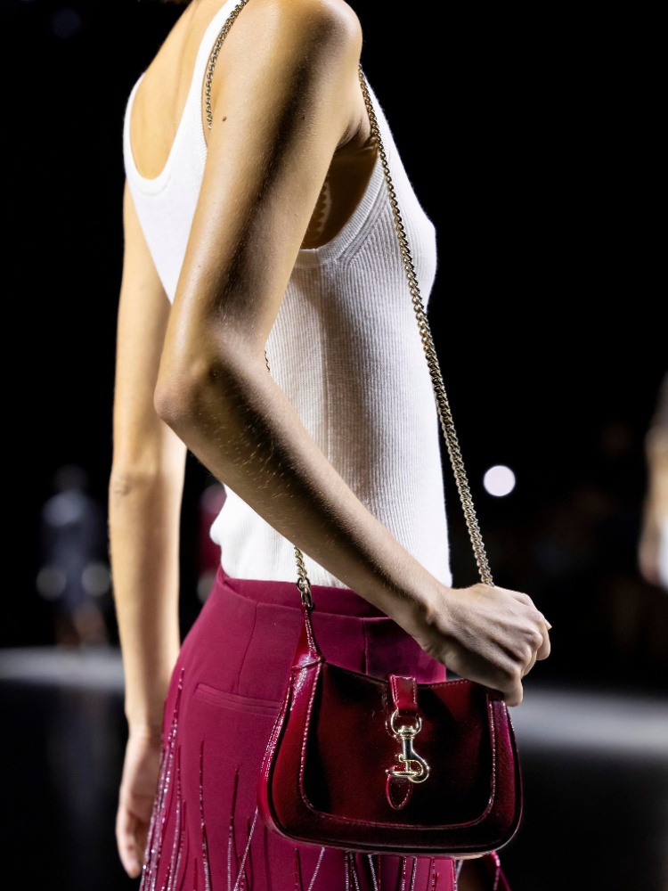
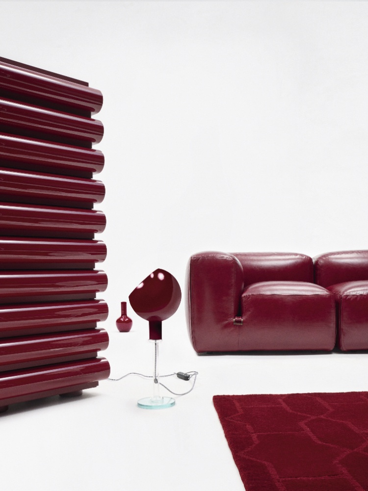
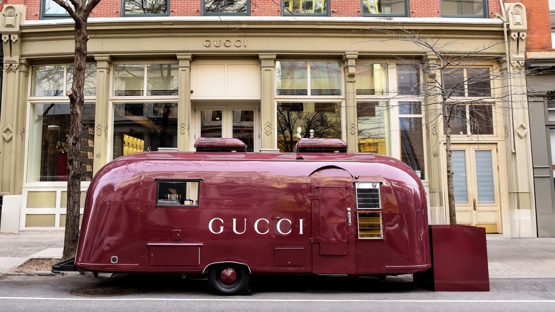
Shortly after, Gucci’s creative director Sabato de Sarno presented Rosso Ancora, a deep, rich shade of merlot. Apart from heavily punctuating his debut spring/summer 2024 collection for Gucci, the colour was splashed across billboards and marketing activations around the world and online. At Milan Design Week this April, De Sarno introduced the Ancora Design project, which reimagines five icons of Italian design in the brand’s new signature shade.

It’s interesting to note how colours have started to play a bigger, more obvious role in promotional campaigns of not just brands, but also their creative directors. “In this world of hyper-personalisation, creative directors are increasingly turning to colour to imprint their own unique signature and express their vision,” Pressman adds.

So long, logomania

Shu Hung, chief creative officer of AKQA, a design company that works with brands such as Loewe, Nike, Louis Vuitton, and Moncler, sees this obsession with colour as a reaction to big logos. “Now that ‘quiet luxury’ or stealth wealth is pushing up against logomania and this really obvious presentation of wealth and brand, designers are rethinking: Okay, well, if it isn’t about a strongly logo-branded item, what are other cues can we use? And colour is a huge motivator.” It makes sense that specific colours are replacing logos and are seen as a refreshing antidote to heavily monogrammed fashion.

“Colour can tell a story before words can. It speaks for you without you having to say anything. It is one of the cleanest, clearest identifiers you could possibly have,” explains Laura Guido-Clark, founder of Love Good Color, a groundbreaking methodology that enables designers to factor in emotive responses when using a colour.

While choosing a colour, she advises focusing on the quality of the colour over the family. “Most people think, I’m going to pick red. [But] It’s the quality of the red. What is the hue? What is the saturation level? That’s what really matters,” adds Guido-Clark. It’s also important that the colour not just reflects who the brand is, but also what the brand wants people to feel about it. And, of course, its cultural connotations should be taken into consideration. “Each culture has colours that could mean something completely different in another. The difficulty is the way you see it on your screen isn’t necessarily the way I see it on mine, and so that is one of the biggest hindrances.”

In India, red has been the choice for Sabyasachi Mukherjee—a colour that is synonymous with sindoor, alta, and the white and red saris traditionally worn by women in West Bengal. “It is a house classic and constant. Brides from all over come to us to get married in ‘Sabyasachi Red’,” he told journalist Sujata Assomull in a Vogue interview. For two consecutive seasons, Gaurav Jai Gupta of Akaaro focused on the use of Yves Klein blue in his collections. Turn Black, a Delhi-based label, uses the non-colour black exclusively, while Gaurav Gupta introduces a new it-colour with every Paris couture outing. So far, his palette of signatures has included electric blue, Artemis yellow, neon and malachite greens, and agni orange.

Consumers are always looking for novelty, and there is such a thing as overdoing it. Hung points to Valentino as an example: “You had this strong collection, but you also had it colliding with the Barbie movie and popular culture embracing pink, so it became like a larger zeitgeist." Eventually, fatigue kicked in, with people remarking how ‘tired’ they were of seeing Valentino Pink. “I think that’s why Tiffany is so smart. It’s subtle; only on the box and in its advertising. But it’s not like they created a whole collection around that colour.”

Are these new trademarks in the making?

Of course, unofficially ‘owning a colour’ is different than trademarking. A brand can ‘own’ a colour through consistent usage across all the different places where it shows up leading to nomenclature like Bottega green. But to legally trademark and protect a colour, a brand must prove it is inextricably linked to its visual identity.

While it may sound easy for luxury brands with major budgets, it’s a complex process with different requirements in every country. Last May, Hermès, which maintains trademark registrations for the orange hue of its product packaging in other countries, was denied its bid in Japan by the Japan Patent Office, despite consistently using the colour on its packaging in the country since the 1960s and citing a survey that indicates a notable portion of high-income Japanese consumers link the orange packaging to the brand.

Valentino Garavani once said, “For Valentino, red is not just a color. It is a non-fading mark, a logo, an iconic element of the brand, a value.” Piccioli expanded the palette with Pink PP. What comes next for Valentino, with Alessandro Michele taking over, is still unclear, but given Michele’s proclivity for diving into archives, we might see a Valentino Rosso revival come September.